
Version: 5.x
vm-pip-control
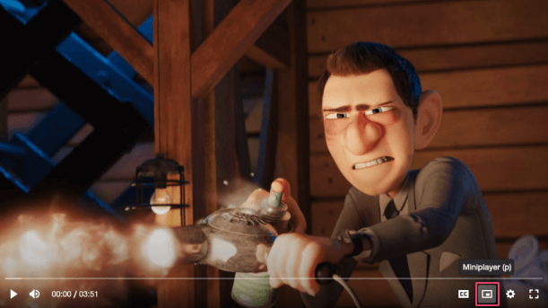
A control for toggling picture-in-picture (PiP) mode. This control is not displayed if PiP cannot
be requested (checked via the canSetPiP() player method).
Visual#
Usage#
- HTML
- React
- Vue
- Svelte
- Stencil
- Angular
example.vue
example.svelte
example.html
Properties#
| Property | Description | Type | Default |
|---|---|---|---|
enterIcon | The name of the enter pip icon to resolve from the icon library. | string | 'pip-enter' |
exitIcon | The name of the exit pip icon to resolve from the icon library. | string | 'pip-exit' |
hideTooltip | Whether the tooltip should not be displayed. | boolean | false |
icons | The name of an icon library to use. Defaults to the library defined by the icons player property. | string ∣ undefined | undefined |
keys | A slash (/) separated string of JS keyboard keys (KeyboardEvent.key), that when caught in a keydown event, will trigger a click event on the control. | string ∣ undefined | 'p' |
tooltipDirection | The direction in which the tooltip should grow. | "left" ∣ "right" ∣ undefined | undefined |
tooltipPosition | Whether the tooltip is positioned above/below the control. | "bottom" ∣ "top" | 'top' |