Version: 5.x
vm-control
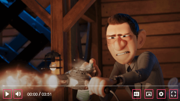
A generic player control that is designed to work with both touch and mouse devices. It also
seamlessly works with vime-tooltip, which can be passed in via the default slot.
Visual#

Usage#
- HTML
- React
- Vue 2
- Vue 3
- Svelte
- Stencil
- Angular
playback-control.vue
playback-control.vue
playback-control.html
playback-control.ts
Properties#
| Property | Description | Type | Default |
|---|---|---|---|
expanded | If the control has a popup menu, this indicates whether the menu is open or not. Sets the aria-expanded property. | boolean ∣ undefined | undefined |
hidden | Whether the control should be displayed or not. | boolean | false |
identifier | The id attribute of the control. | string ∣ undefined | undefined |
keys | A slash (/) separated string of JS keyboard keys (KeyboardEvent.key), that when caught in a keydown event, will trigger a click event on the control. | string ∣ undefined | undefined |
label (required) | The aria-label property of the control. | string | undefined |
menu | If the control has a popup menu, then this should be the id of said menu. Sets the aria-controls property. | string ∣ undefined | undefined |
pressed | If the control is a toggle, this indicated whether the control is in a "pressed" state or not. Sets the aria-pressed property. | boolean ∣ undefined | undefined |
Methods#
| Method | Description | Signature |
|---|---|---|
blurControl | Removes focus from the control. | blurControl() => Promise<void> |
focusControl | Focuses the control. | focusControl() => Promise<void> |
Events#
| Event | Description | Type |
|---|---|---|
vmBlur | Emitted when the control loses focus. | CustomEvent<void> |
vmFocus | Emitted when the control receives focus. | CustomEvent<void> |
vmInteractionChange | Emitted when the user is interacting with the control by focusing, touching or hovering on it. | CustomEvent<boolean> |
Slots#
| Slot | Description |
|---|---|
| Used to pass in the content of the control (text/icon/tooltip). |
CSS Custom Properties#
| Name | Description |
|---|---|
--vm-control-bg | The background of the control. |
--vm-control-border | The border of the control. |
--vm-control-border-radius | The border radius of the control. |
--vm-control-color | The text color of the control. |
--vm-control-focus-bg | The background colour of a control when it is being hovered on or focused. |
--vm-control-focus-color | The text colour of a control when it is being hovered on or focused. |
--vm-control-icon-size | The size of the icon in pixels. |
--vm-control-padding | The padding inside the control. |
--vm-control-scale | The amount to scale the control up/down by. |
--vm-control-tap-highlight | The highlight color when a control is tapped. |
