
Version: 4.x
vime-menu-radio
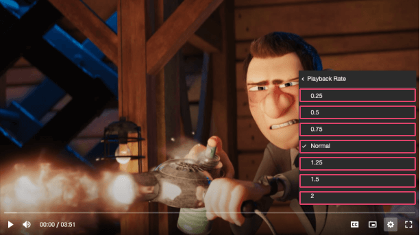
Menu radio buttons are presented in radio groups (a collection of radio buttons describing a set of related options). Only one radio button in a group can be selected at the same time.
Visual#
Usage#
- HTML
- React
- Vue
- Svelte
- Stencil
- Angular
example.vue
example.svelte
example.html
Properties#
| Property | Attribute | Description | Type | Default |
|---|---|---|---|---|
badge | badge | This can provide additional context about the value. For example, if the option is for a set of video qualities, the badge could describe whether the quality is UHD, HD etc. | string ∣ undefined | undefined |
checked | checked | Whether the radio item is selected or not. | boolean | false |
checkedIcon | checked-icon | The URL to an SVG element or fragment to load. | string ∣ undefined | '#vime-checkmark' |
label (required) | label | The title of the radio item displayed to the user. | string | undefined |
value (required) | value | The value associated with this radio item. | string | undefined |
Events#
| Event | Description | Type |
|---|---|---|
vCheck | Emitted when the radio button is selected. | CustomEvent<void> |
Dependencies#
Used by#
Depends on#
Graph#
Built with StencilJS