
Version: 4.x
vime-default-ui
This component is a shorthand way to setup the entire default vime user interface, such as controls, settings, captions and so on.
Visuals#
There are also alternative interfaces for live media, and the light player theme, but they're not shown here for the sake of brevity.
Audio#

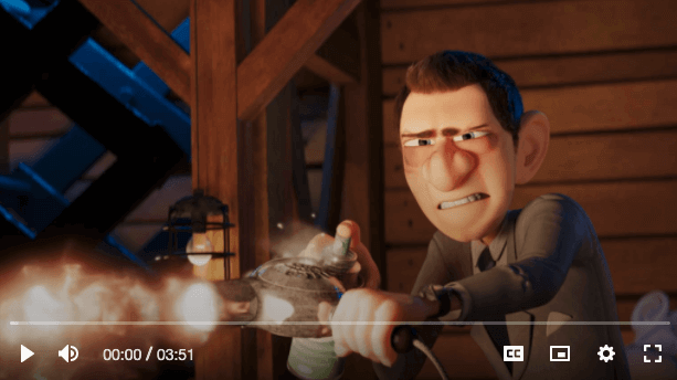
Desktop Video#
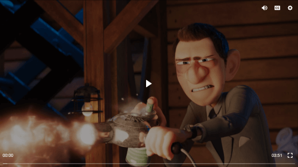
Mobile Video#
Usage#
- HTML
- React
- Vue
- Svelte
- Stencil
- Angular
example.vue
example.svelte
example.html
Properties#
| Property | Attribute | Description | Type | Default |
|---|---|---|---|---|
noCaptions | no-captions | Whether the custom captions UI should not be loaded. | boolean | false |
noClickToPlay | no-click-to-play | Whether clicking the player should not toggle playback. | boolean | false |
noControls | no-controls | Whether the custom default controls should not be loaded. | boolean | false |
noDblClickFullscreen | no-dbl-click-fullscreen | Whether double clicking the player should not toggle fullscreen mode. | boolean | false |
noIcons | no-icons | Whether the default icons should not be loaded. | boolean | false |
noPoster | no-poster | Whether the custom poster UI should not be loaded. | boolean | false |
noSettings | no-settings | Whether the custom default settings menu should not be loaded. | boolean | false |
noSkeleton | no-skeleton | Whether the skeleton loading animation should be shown while the player is loading. | boolean | false |
noSpinner | no-spinner | Whether the custom spinner UI should not be loaded. | boolean | false |
Slots#
| Slot | Description |
|---|---|
| Used to extend the default user interface with custom UI components. |
Dependencies#
Used by#
Depends on#
- vime-ui
- vime-icons
- vime-skeleton
- vime-click-to-play
- vime-dbl-click-fullscreen
- vime-captions
- vime-poster
- vime-spinner
- vime-default-controls
- vime-default-settings
Graph#
Built with StencilJS